Dear Seattle Mariners,
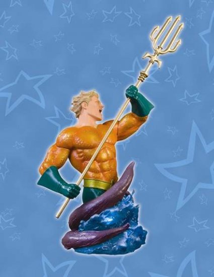
Please go back to your King Trident logo. It is my personally favorite of all-time and sooooo much better than that damn compass logo. And don't even get me started about the "S" logo. You see, the trident is one of the coolest weapons of all time and when upside down it makes the first letter of the teams name. Plus Aquaman uses a trident. Frickin' Aquaman. You should thank the baseball gods that you stumbled upon such a great idea and you should embrace it...not ignore it as an "old logo."
Sincerely,
Matt F.


Comments
The only time I know of the logo getting some love was with a journeyman cheater Methuselah.
As a kind in Washington State in the early 80s, I always liked the trident, and it didn't help things when they just went with a generic ball and "M's" . They still sucked and the logo was uninteresting. The abbreviation thing works for the A's, because they're like a thousand-year-old ball club. Not so much for the Mariners.
It wasn't until they went to their new park, got all nautical compass rose-y with their current logo that they have had some winning.
Now though, I think the current one is starting to look tired and loser-y. Teal-dominance is such a mid 1990s thing; it looks like the color scheme of airport carpeting.
It's time to bring back the trident, but being used by a mascot.
Maybe something like this guy, but all fierce like this.